
 Heaven's Engines
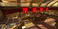 Industrial Revolution
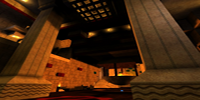 T I T A N S
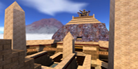 Lost Colossus
 Grazer Station
>>> Get It! (jlctf1.zip) <<<
This map deviates from the usual Q3CTF map formula, with a bit of Team Fortress influence on the layout, and the tasteful(?) use of devices like doors, buttons, wind tunnels, and forcefields. Custom texturing and angular architecture create a futuristic research station, embedded in an asteroid grazing the surface of Jupiter in its orbit. Don't get mesmerized by the Great Red Spot!

Bots have some limitations on this map. They don't understand how to use the "express elevator" from basement to flagroom, and they can't figure out how to get into the tower.
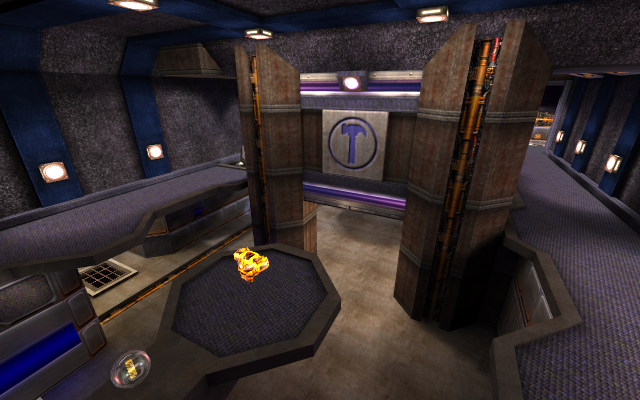
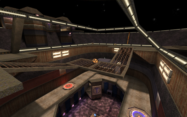
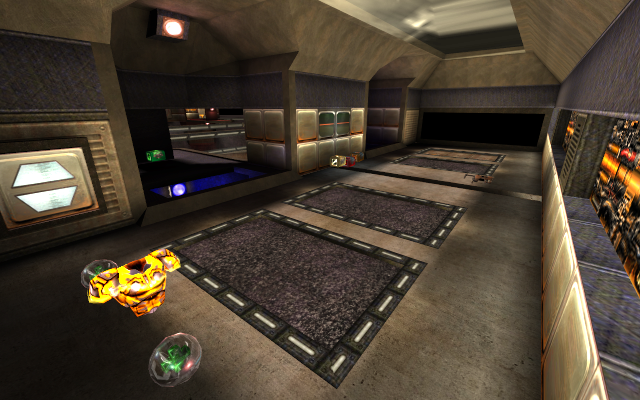
Each team has an underground base area, with the flag, and a tower that overlooks the center. The center contains a multilevel dome and surrounding path. Underground halls connect the dome and base; from the tower you can drop down to the path, and then either drop down again into the underground or else rocketjump into the dome.
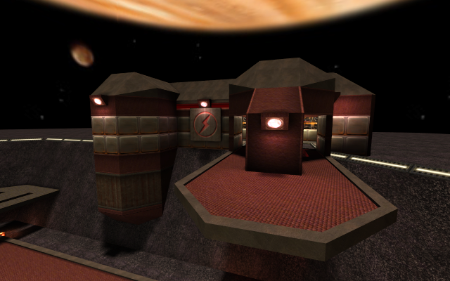
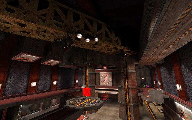
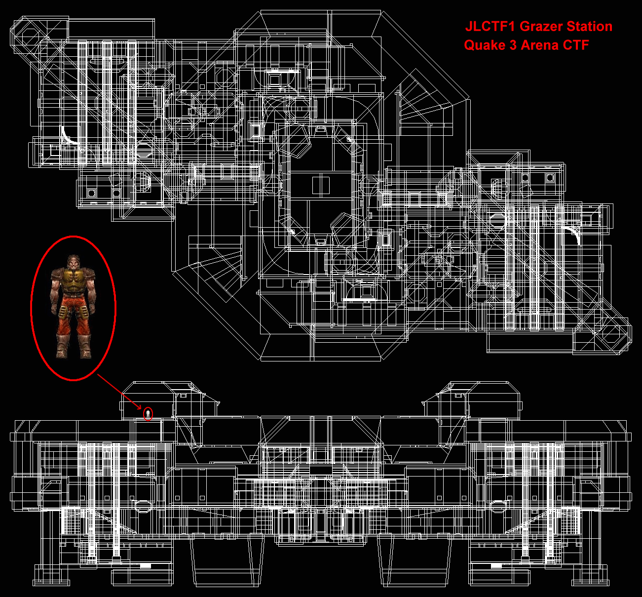
Since much of the map is beneath a textured surface (the top/outer "ground" layer), it's impossible to get a good view of the layout by flying out of the map and taking a screenshot. For what it's worth, here's a bird's-eye view that shows the center section and towers... a lot is still hidden in this screenshot, but I just like the picture. More rambling about the layout is in the Notes section below.

This was my first piece of content creation for any game, and a moderately early release as Q3CTF maps in general go. Under those conditions I think it was a pretty good map. But from a modern standpoint this is certainly not one of the great Q3CTF maps; it's possible to deviate too much from the formula. As a first map, though, I'm happy with it. Its technical aspects could be improved in many ways, but probably the only thing that embarrasses me about it is the chattiness of the readme.
I was clearly jonesing for an oldschool CTF map, in the complicated & gimmicky sense. I'd guess that most mappers splurge on "neat ideas" in their first attempt... me, I put in forcefields, a ManCannon for each basement, doors linked to visual effects, videoscreens for peering into the opposite half of the map, and a selection of supersized vertical jumps & falls. I've got to admit that the sheer goofiness of it all still appeals to me, but it doesn't completely atone for some layout sins and the use of the battlesuit powerup.
Aside from the urge to commit felony gimmickry, I didn't have much of a plan when I started the map. I began with the red flag platform, doing complete geometry+texturing+lighting as I went along. Dropping in the first spotlights around the unfinished platform and loading it up in-game for the first time... that was a thrill! I was happy just puttering around in the flagroom for quite a while, but I eventually decided I'd better get on with the rest of the map, thinking that I could adapt some Team Fortress "2fort" flavor to a Q3CTF style.
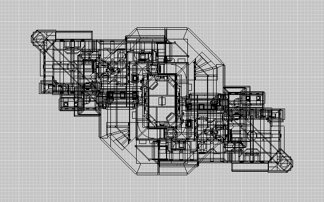
The resulting layout is nice and weird. At the very least I avoided the "figure eight" cliché in symmetrical CTF design. Here's my best attempt at drawing the topology:
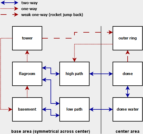
It almost looks like a guiding plan was at work!
But I can tell you for sure that I didn't actually have any such plan in mind. It's interesting though; that's a lot of one-way connections, especially in a map without teleporters. It helps keep the map from being hugely over-connected for Q3CTF. Instead, it's only... moderately over-connected? The center at least could stand to be narrowed down topologically.
It was hard to come by non-neoGothic textures for Q3 mapping back then, and Iikka Keränen's IkbaseQ3 texture set was a godsend for anyone working on future-industrial schemes. Not overly complicated or detailed, just a consistent & quality toolbox for sprucing up your brushwork. Or maybe I liked it because it made me all nostalgic for Q1 & Q2 custom maps. In any case, thanks Iikka!
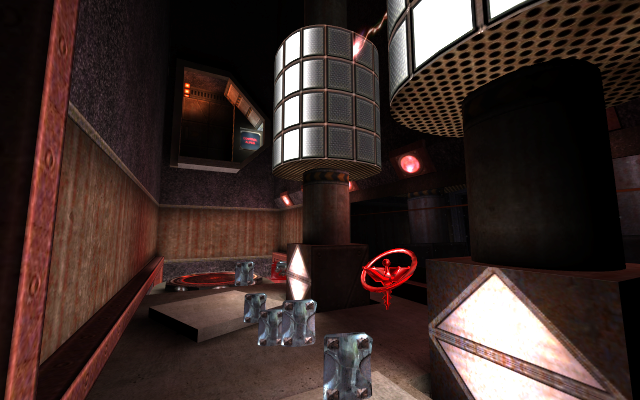
The tower and basement areas are home to several of the map's oddities — too numerous to describe here, mostly abusing func_door entities for purposes that seemed clever at the time. The most egregious bit of fakery though is in the interface between those two areas:
I wanted the basement room to look very tall, with the ceiling and the vertical columns "lost in darkness" as you look up. It was tough to pull off the correct look with lighting tricks, especially because the room actually wasn't that tall — the tower room is overhead. And there's a trapdoor up there, which would totally kill the illusion when it opened.
My solution was to add a baklava-like stack of 8 "nodraw" brushes just beneath the ceiling, each brush with its bottom face textured by this simple shader:
    textures/jlctf1/dimmer
    {
        surfaceparm trans
        surfaceparm nonsolid
        surfaceparm nomarks
        surfaceparm noimpact
        surfaceparm nolightmap
        qer_trans 0.5
        {
            map textures/jlctf1/grey.jpg // solid medium-grey
            blendFunc filter
        }
    }
The shader for the topmost layer is slightly different: it doesn't have the blendFunc, so it acts as a visual backstop. Viewed from above (through the trapdoor), all these surfaces are completely transparent. From below, each one dims the area above it a little bit more, until total blackness is reached. Since the overall lighting in the top of the room is already dim, the effect is pretty good for a hack.
A few FPS-standard lava pits make an appearance in this map. It offended me that they were basically just open-topped stone boxes filled with lava... how does that setup happen? So in every lava pit, at least one of the sidewalls opens at the bottom into a lava-filled crawlspace, to explain where the stuff is coming from. You'll never see this while playing the map unless you die in the lava and your remains drift to the floor right next to, and facing, one of those openings.
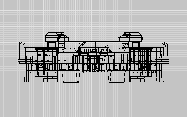
Also: I came across the image below while cleaning out an old hard drive, and I think it's something I used when first posting the completed map to the Quake3World forums. At first glance it's just another way of showing the layout and bones of the map; the group "makes/plays custom maps" overlaps a lot with the group "thinks that things reminiscent of blueprints and architectural drawings are cool". But the insertion of that little Quake Ranger dude (ostensibly for scale) makes it extra-clear what had first grabbed me about mapping: Look, there you are! Inside this place that I made!
You may come across some other versions of this map around the web, as I was asked to allow variants of this map for use with some mods. In a couple of cases, the mod authors requested that I make a few specific changes and then pass the resulting map to them, but the end result wasn't a big hit with the players as far as I know. In another case, I handed the source over to the mod's mappers for final changes and build; they then released the map without running it by me first, and it has a monumentally prominent error that they introduced. That still bugs me, since that version of the map is still floating around the internet with my name on it. I'm sure there's a moral to that story in there somewhere.

 ) except where indicated otherwise